
The popularity of mobile gadgets highlights the importance of responsive websites for various devices and screen sizes. That’s why Responsive Front-End Design is the path to your business success online. If you require Front-end Development Services, this information is exactly what you need!
What Is Responsive Design Technology?
What device are you using to read this article — your mobile phone, right? This once again proves how crucial website adaptability is today. A web design that adjusts to the user’s device significantly increases engagement, improves search engine rankings, and saves both money and time.
Or maybe we’re mistaken, and you’re using a computer right now. Even so, can you deny that adaptability is no longer a luxury but a necessity? It ensures accessibility and convenience for all users, helping businesses maintain a professional image.
Definition and Core Principles
Responsive web design (RWD) is an approach that enables websites to adapt to a user’s device, regardless of screen size or type. This technology provides equal opportunities for desktop, tablet, and smartphone users to view content seamlessly. The key principle of RWD is flexibility, meaning all website elements dynamically adjust to both large and small screens.
In general, responsive web design is based on three key components:
The Importance of Responsive Front-end Design for Businesses
Fluid Grids.
Media Queries.
Flexible Images and Typography.
Thanks to these elements, RWD guarantees an intuitive and visually appealing user experience, enhancing overall user satisfaction.
Why Mobile Traffic is Crucial?
Mobile devices have revolutionized how brands interact with audiences online. According to the latest data, as of October 2024, 63.38% of global web traffic came from mobile devices. Isn’t that the dominant force in digital interaction?
On the other hand, non-responsive websites alienate a significant portion of the audience. When users encounter slow-loading pages or distorted content, they are more likely to leave and search for alternatives. This directly affects bounce rates, conversion rates, and overall trust in your business. And we’re sure that wasn’t part of your plans.
Responsive web design can improve these metrics, making the investment not only justified but essential for companies aiming to thrive in today’s digital landscape.
The Business Benefits of Responsive Design
Investing in a responsive eCommerce website is no longer a luxury. Beyond aesthetics, it provides a host of advantages for your company.
User Experience and Engagement
A website is the face of a company, often serving as the first interaction between a customer and the business. At this point, there are two possible outcomes:
Better user experience (UX), leaving a lasting impression and building trust.
A negative experience, prompting potential customers to turn to competitors.
The choice is yours, but with the first option, you’ll gain at least:
A lower bounce rate.
Longer session durations.
Positive brand perception.
Isn’t that exactly what you need?
SEO Advantages
Search Engine Optimization (SEO) directly impacts the attraction of organic traffic to your website. And this isn’t just talk. For instance, Google prioritizes websites optimized for mobile devices, such as smartphones and tablets, in its rankings. By embracing responsive design on your site, you enhance its visibility in the results of the global search engine.
How responsive design can help improve SEO? It's simple.
You’ll only need one URL for all devices, eliminating the need for duplicate content.
Improved loading speeds thanks to search engine optimization.
A reduced bounce rate as a signal of high-quality content.
This way, your business can capture the attention of both mobile users and desktop users, amplifying your online presence and improving visibility.
Higher Conversion Rates
Think a responsive website only attracts visitors? Not at all. It also encourages them to take action: make a purchase, subscribe to a newsletter, or submit a contact form.
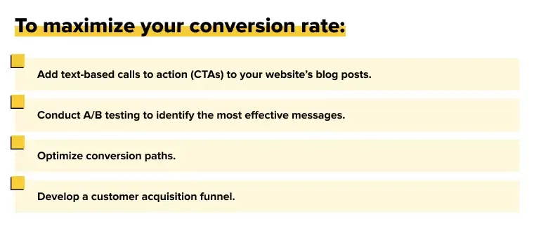
The higher your website’s conversion rate, the greater your success in turning potential clients into paying customers.
Responsive Design and SEO: A Winning Combination
With responsive design in mind, you enhance the user experience, which in turn positively impacts your website’s ranking and overall SEO effectiveness. Together, they form a powerful duo that complements each other seamlessly.
How Google’s Mobile-First Indexing Impacts Your Site
Mobile-first indexing means that search engines, including Google, prioritize the mobile version of a website when determining rankings. If your page isn’t optimized for mobile devices, its visibility in search results will suffer.
By adapting your site, many benefits of mobile-first optimization won’t take long to appear. These include:
Top positions on search engine results pages (SERPs).
Enhanced visibility for mobile users, who account for over 68% of web traffic.
Higher engagement and a reduced bounce rate.
A gadget-friendly site signals to search engines that your content is accessible and relevant.
Unified URL Structure
Responsive design utilizes a single URL to serve all devices without splitting into desktop and mobile versions of the site. This approach means:
Simplified crawling and indexing for search engines, leading to better rankings.
Elimination of the risk of duplicate content.
Easier link management, as all backlinks point to the same URL, strengthening your domain authority and improving overall SEO performance.
This ensures a straightforward and clear path to your website.
Faster Load Speeds
In today’s world, speed is a critical factor for both users and search engine rankings. Visitors expect pages to load within seconds. By adapting your site, you achieve:
Enhanced user experience (encouraging users to stay on the page).
Better rankings in search engines.
Increased conversions among users.
Responsive web design and SEO work together to build a solid foundation for success in the online space. Optimizing your website not only aligns with current search engine requirements but also provides a strategic advantage for growth in today’s competitive landscape.
Key Components of a Successful Responsive Design
When discussing the creation responsive designs that easily adapt to various devices and screen sizes, several features make this possible:
Fluid Grids
These form the backbone of responsive design. They offer significant advantages over fixed pixel layouts, such as:
Scalable layouts.
Improved flexibility.
Efficient design processes.
This allows seamless accommodation of a wide range of devices without compromising content integrity.
Media Queries
Media queries in CSS (Cascading Style Sheets) allow a website to adjust to specific devices or screen resolutions. They apply different styles based on device characteristics and ensure that the content remains visually appealing and functional across various platforms. How does it work?
First, the properties of the user's device (screen width, height, and orientation) are evaluated. Then, different CSS rules are applied. This results in an optimized layout for each device, enhancing user satisfaction and engagement.
Flexible Images and Typography
These are essential elements of any website, and they must easily adapt to ensure responsive design. Text must be readable and appropriately adjusted to fit different screen sizes.
Successful responsive design combines these features into a unified strategy that works together to create an intuitive and adaptive website.
Consult professionals on this matter, and your website will be accessible and attractive in the modern world.
Real-World Applications: Responsive Design in Action
Companies striving to thrive in today's digital landscape must be ready to adapt — in this case, by optimizing their websites. And we’re not saying this just because it’s our job. You’ll see for yourself.
eCommerce Success
According to Gauss, 77% of online shopping traffic and 65% of retail orders in the U.S. come from mobile devices. Understand the implication? Yes, in the eCommerce sector, without responsive design, you stand no chance. Harsh? No, just truthful.
Do you want your customers to:
browse products with ease,
read reviews,
make purchases from any device?
Adapt your website, and your customers are likely not just to visit once but to keep coming back.
Healthcare Accessibility
Today, all healthcare platforms rely on responsive websites to deliver essential information and services. Through optimization, patients can:
check medical records,
schedule appointments,
consult healthcare professionals on any device.
A gadget-optimized site complies with The Americans with Disabilities Act (ADA) and enhances usability for all users.
Hospitals and clinics not only provide convenience but also build trust and authority in their digital presence.
Startups and Small Businesses
For startups and small businesses, a responsive website is a cost-effective solution. With limited budgets, it’s crucial to maximize the impact of digital investments. Responsive design helps startups achieve:
Accessibility for a broader audience.
Enhanced brand trust.
Increased conversions.
Better search engine rankings.
Thus, it’s not just about convenience but a strategic tool to attract customers, boost sales, and drive business growth.
Investing in responsive design technology ensures that your business website remains relevant, competitive, and connected to its audience in the digital era.
How to Get Started with Responsive Design
How do you create a responsive website that ensures exceptional user interaction across all devices? We can't claim it's a quick process — it requires a sequence of steps and a comprehensive understanding of the big picture.
Audit Your Current Website
Before diving into responsive design, start with a thorough audit of your website:
Evaluate its current performance across different devices and screen sizes, navigation, load time, and overall usability.
Identify pain points, such as fixed-width layouts or elements and images that don't scale properly.
A deep understanding of your website's current performance lays the groundwork for meaningful improvements.
Choose the Right Tools
Responsive design becomes manageable with the right frameworks and tools. These often provide pre-designed grids, components, and templates easily adaptable to various screen sizes.
We rely on tested tools for evaluation:
Physical devices;
Emulators and simulators;
Real device cloud platforms.
The right tools simplify complex processes, ensuring your design is not only functional but also aesthetically appealing.
Test Across Devices
After implementing responsive design, conduct thorough testing to guarantee a stable user experience.
Using specialized tools, review how your site appears on mobile and desktop devices, operating systems, browsers, and screen sizes. Pay special attention to details like font size and button spacing, as the overall picture is built from small details.
Testing under real-world conditions and at early stages ensures your users will enjoy a seamless and functional experience regardless of the device.
Partner with Experts
A responsive design developer must combine technical expertise with creative insight. By collaborating with experienced web developers, you can rest assured that your website will not only look impressive but also be efficient and user-friendly. We can do everything necessary to optimize your code, integrate advanced features, and resolve any issues during the development process.
Contact us to achieve results that align with your business goals and meet your users' expectations.
Conclusion: The Future is Responsive
Do you want to thrive in a digital-first world? Then you need to understand one thing: a front-end developer is not a luxury, but a necessity.
We see that the majority of users access websites from mobile devices. Therefore, a mobile-first approach will improve user satisfaction and search engine rankings, ensuring the growth of your business.
Are you launching a new website or updating an existing one? Remember, investing in responsive design is a strategic step toward staying competitive. Start today and secure your future online presence.