
A user opening a website for the first time evaluates it within seconds. That is why high-quality UX content writing becomes a decisive factor in the success of a digital product. It is the art of guiding through the interface, making every interaction intuitive.
This article is unique because we do not just talk about best practices. We show real UX writing examples from Lampa.dev projects, based on the results of UX audits. Here you will find examples of good text that improved conversions, increased retention, and strengthened the image of our clients.
What is UX Writing?
It is about writing text that helps users interact correctly with an interface, from buttons to the 404 page. A UX writer works closely with the UX team, which includes designers, researchers, and developers. Only together can they create a smooth and cohesive user experience.
This is not simple copywriting; it is an integral part of product design. UX writing and copywriting differ in their goals.
If copywriting sells, UX writing focuses on the average user, who should be able to understand the interface without extra effort. This approach requires active voice, clarity, and empathy. UX writing may seem invisible, but it shapes the entire user experience.
Key Principles of Good UX Writing
High-quality UX text is built on five main principles:
Clarity. Super clear formulations that are easy to understand. Any ambiguity or difficulty in perception slows the user and increases the likelihood of errors.
Conciseness. Concise expressions without unnecessary words. Long texts reduce concentration. UX writing uses short but meaningful phrases that are quickly read and retain attention.
Empathy. Understanding potential user problems. A good UX copy helps solve tasks without stress.
Consistency. A unified voice and tone throughout the interface create the feeling of a cohesive, professional product and help users navigate faster.
Inclusivity. The ability for users to express themselves regardless of gender, language, or ability. This includes simple formulations, avoiding slang, and checking compatibility with screen readers.
These principles are not just theory. They are the foundation of the goal of UX writing, as they make the interface understandable. It is important to find the right words so that the user does not get lost at the initial stages of interaction.
Case:
The team of the Urban Traffic Management Solution project (a cloud platform developed to optimize city traffic) faced a problem.
The interface was overloaded with technical terms (“segment 4A,” “load 78%,” “GPS defect,” and so on), which prevented users from quickly understanding the road situation and making correct decisions.

UX writers reworked the texts, which subsequently reduced navigation errors. In particular, visual cues, explanations, and contextual formulations were added.
Practical Examples of Good UX Writing
Practice is more effective than theory because it shows how principles work in a live product, not in abstraction.
Cases allow you to see:
How text adapts to a specific audience, device, or usage scenario.
Which formulations help avoid errors and reduce cognitive load.
Which results confirm that text influences behavior (increased conversion, reduced drop-offs, or improved user experience).
Real UX copy examples from our cases demonstrate exactly how we apply the 5 main principles in our projects. They make it possible to see specific solutions that help users navigate faster and make fewer mistakes, while our clients gain increased conversion rates.
Clear Actions
Precise and effective calls to action are needed. The user must immediately understand what will happen after the click. Especially in the first few seconds, when attention is highly limited.
UX writer examples show how even a single word can completely change user behavior. For example, when “Submit” turns into “Get Cashback,” the result is a flawless CTA!
A poor CTA includes “Send” or “Continue,” as it does not indicate what will happen. A good CTA:
“Download report” or “Book a consultation.”
It is not only clear but also action-oriented, as it helps guide the user toward the goal.
Case:
In the LetyShops project, the Lampa team replaced neutral buttons with more active and specific ones. For example, instead of “Register,” they used “Start Saving,” which strengthened the brand voice and made the interface more friendly.
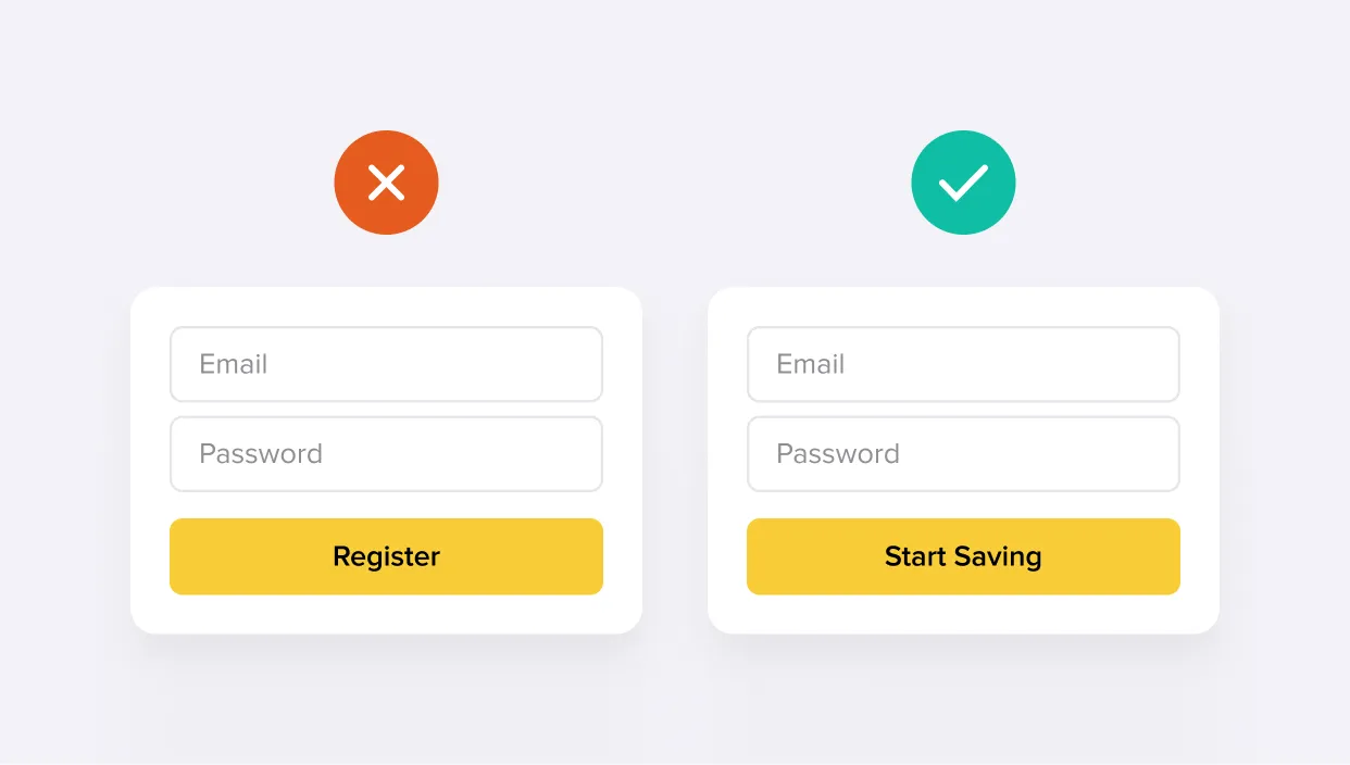
The result was an increase in Click-Through Rate (CTR) and higher conversion at the registration stage. This clearly demonstrates how effective UX writing directly impacts the success of a digital product.
Onboarding Guidance
In the first seconds, a person decides whether to leave or continue using the product. UX writing at this stage simplifies the steps. It clearly conveys the necessary information and makes the interaction comfortable.
For example, “Welcome! Get started” does not explain or motivate. Good UX copy looks like this:
“Let’s set up your profile; it will take less than a minute” or “You’re almost there! Only two steps left.”
Such texts helpfully explain what needs to be done and allow the user to feel confident. UX content writing improves the experience, turning dry instructions into friendly interaction.
Case:
In a therapeutic service app project, the Lampa team faced a problem where users did not complete registration. The UX writer chose more human and guiding text.
Instead of the banal “Fill out the form,” they implemented: “Tell us a little about yourself so we can match you with the right specialist.” This improved engagement and increased onboarding completion rates.
Error Messages & Empty States
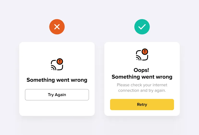
UX writing examples show that poor error messages can not only irritate but also drive users away from the site. A classic example of bad UX writing: “Something went wrong.” It neither explains the issue nor offers a solution and may even blame the user.
It is important, on the contrary, to explain what happened and what steps need to be taken to fix the problem. For example:
“This book is temporarily unavailable. Try selecting another one!” or “We could not load the data. Check your internet connection and try again!”
Such texts make the user feel supported, as they help quickly understand what to do next.
Another important point is the empty state. Instead of a blank screen, a UX writer can add a piece of microcopy to guide the user:
“Your favorite articles will appear here. While you haven’t added any, start with our selection.”
Case:
In the Audiokitab project, the Lampa team reworked error messages and empty states, adding a friendly tone and practical advice. The result was not only higher user retention but also improved perception of the brand image.
The Human Touch & Brand Personality
The user interacts not just with the interface but with the brand itself. That is why the style of the text should reflect the product’s identity.
A formal tone may be suitable for a banking application. In a media or lifestyle service, a conversational tone works better.
For example, instead of “You are not authorized,” to motivate users it is better to choose:
“It looks like you’re not signed in. Let’s fix that!”
Case:
Here is one of the good UX writing examples where the text evokes emotions and makes the interaction enjoyable. In the Dogiz project (an app for dog owners), the Lampa team implemented a friendly style.
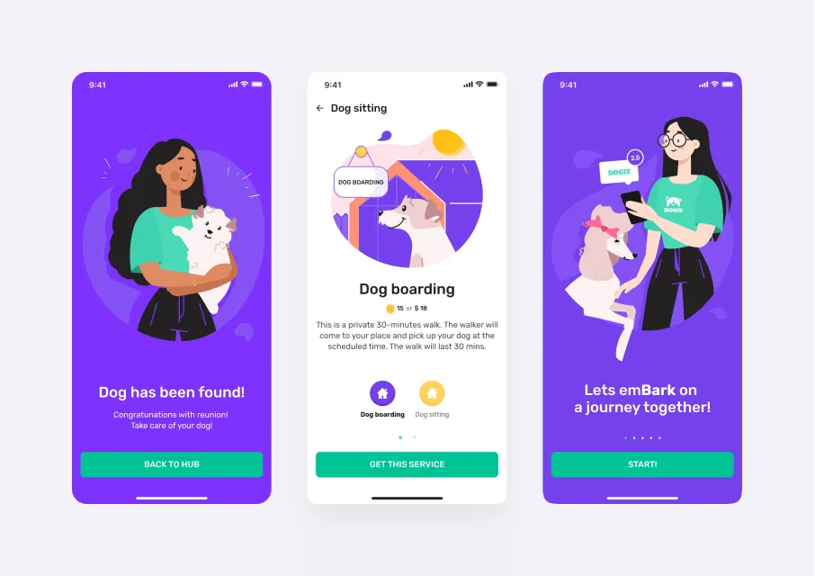
As a result, customer loyalty significantly increased. Users started returning to the app more often and actively using the service’s features.
Motivation & Retention
Good UX copy reminds and encourages without pressure, which is especially important for products where retention plays a key role.
For example, take push notifications. A poor text looks like this: “You haven’t logged in for a while.” A good UX writing example that increases engagement:
“You have 3 new bonuses – check them out now!”
Case:
In the gaming app project Just Play, the Lampa team implemented various motivational texts that prompted players to take further actions.
The result? Increased return visits and longer time spent on the service. UX writing enhances the user experience, turning the interface into an assistant that inspires users to come back.
Accessibility & Inclusivity
Text should be understandable to people with cognitive differences, low vision, and varying levels of digital literacy. Inclusive UX writing helps ensure every message considers users’ abilities, language, and context.
For example, instead of “Click here,” it is better to write:
“Open Settings.”
This makes the text understandable when read aloud by screen readers.
It is also important to consider cultural differences. In international products, idioms and slang should be avoided to maintain a neutral tone.
Case:
The Lampa team, together with the city transportation department, developed the Urban Traffic Management Solution project, implementing clear notifications and more specific instructions for drivers.
For example, “Take an alternate route” instead of “OK.” Results showed a significant reduction in average driver response time to road events.
Clarity in Data Visualization
Even the most beautiful charts lose meaning if the accompanying text does not explain what the user is seeing and why. Labels, hints, and explanations turn complex technical data into an understandable tool, reducing cognitive load. They become not just an addition but a part of user experience writing.
An example of poor UX text in data visualization looks like this:
A chart with axes without labels, where it is unclear what metrics are being measured and over which period.
A good UX copy clarifies the context instead. For example: “Average keg consumption rate over the last hour”
Or “Number of portions sold at each location in real time.”
Such texts help the user instantly interpret data and make decisions based on important information.
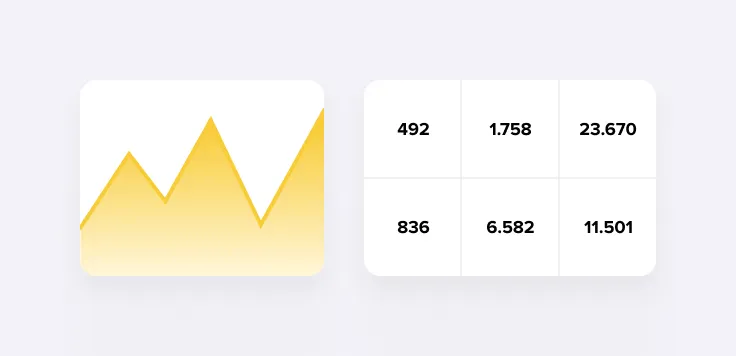
Case:
In the Keg Speed project, the Lampa writing team added explanatory texts to production metrics charts. Thanks to these explanations, operators were able to react more quickly to changes, reduce errors, and improve operational efficiency.
This is a classic example of how UX writing can deliver the right meaning at the right moment to prevent potential concerns.
Entertainment & Tone
UX writing is not always about seriousness. In entertainment products, text becomes part of the product or service, and its tone plays a key role. It not only sets the mood and shapes expectations but also makes interaction with the site emotionally engaging.
Light pieces of text should work as part of UX design. However, it is necessary to maintain a balance so that the text is both useful and appropriate:
Do not overload the interface with jokes (especially in the first few seconds on the site).
Consider the target audience (children, teenagers, adults).
Maintain clarity even in an entertaining tone (clear and direct formulations are important).
For example, media applications use different tones. In a music service, a greeting might sound like: “Turn it up! Your evening is just beginning!” while in a movie service: “Ready for a series marathon?”
Unlike the dry “Welcome,” such texts are written so that they are likely to be read, as they create a specific mood.
Case:
In the Virgin Radio project, UX writing was built on a bold and energetic style. This tone significantly increased listener engagement.
The text encourages and even jokes, but always stays within the brand and adheres to the main goal of UX writing.
Key Takeaways
The Lampa team considers UX copy as part of the design process, closely connected with the work of the design team and web development, rather than as a decorative element.
Here are the main insights from the cases:
Short pieces of text guide actions, reduce errors, and help with the interface. They speed up task completion because the user path becomes more predictable.
A friendly style makes the product feel closer, especially in the first few seconds. This tone encourages continued interaction.
Captions, alt text, and explanations turn charts into insights. They help users make decisions faster by reducing cognitive load.
Clear and well-thought-out text makes the product accessible. It opens the interface to a wider audience, including people with different levels of digital literacy.
The right words at the right moment increase retention and stimulate logins. This approach turns text into an effective tool for boosting conversion rates.
UX writing can be fun, bold, and lively, especially in interfaces with dynamic menus.
When a brand communicates clearly, honestly, and purposefully, the user listens, understands, and always returns.