
Designers and authors of our articles have compiled a list of principles for identifying good design. The fact that someone can create a list of principles for design already suggests that there are rules to this game. So don't rely on the argument, "I'm a designer, I see it that way."
Of course, design decisions are subjective, but that doesn't prevent the author from distinguishing good design from bad.
Sign 1: Effective Design
Design is created to solve a problem. The problem can be anything: an inconvenient website, a product for a specific audience, or a new business that needs a logo.
If it doesn't solve the problem, it's bad design, and continuing is pointless. Often, this point causes friction between designers and clients or supervisors. Designers start working without a sufficient understanding of the problem, trying to create something cool that will look good in their portfolio. They forget that design is created not to solve their problems but for people.
When you start working, ask yourself, "Why?" until you realize the true goal for which your design is needed.
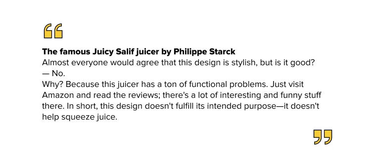
So, an attractive appearance does not equal good design.
Sign 2: Design Alignment With The Brand
To assess whether you are moving in the right direction, you need to understand two things first: the brand and the audience.
The target audience of a company can vary from vast masses to very narrow niches. If you know what image the company aims for and for whom the design is created, the next step is to determine what suits them.
The broader the audience, the clearer and simpler the design should be. That's why you can see many companies lose their "soul" as they grow. This happens because some design techniques that work for small niches do not fit a larger audience, and they are sacrificed to attract more people. On the other hand, when your audience is smaller and more specific, these tricks attract people.
You can see this by comparing McDonald's with a local burger joint. They sell the same product but differently.
The local burger joint uses modern design solutions, attracting people who keep an eye on innovations. Look at the fun illustrations on Byron's website. On the other side of the scale, McDonald's communicates with customers in a more accessible manner, addressing a broader audience without singling anyone out or rejecting anyone.
Sign 3: Timeless Design
Good design resonates with time. Ideally, everyone wants a timeless design, but it's not always appropriate or necessary.
For example, if you're creating a web page for a product that will be replaced or updated within 2 years, it makes sense to incorporate current design trends to stay ahead. This will make your design look modern, trendy, and current. However, you need to anticipate trends and their evolution. There's nothing worse than catching the wave too late and being a follower rather than a trendsetter. You'll only be laughed at.
When it comes to a logo that should last for years or even decades, it's certainly best to avoid trendy design choices with a short shelf life. Take a look at Starbucks' well-known logo redesign, where there's a trend toward simplification. Conclusion: the simpler the design, the longer it will endure.
Starbucks Logo Iterations from 1971, 1987, 1992, 2011.
To meet this criterion, you need to understand the lifecycle of the design and choose an appropriate solution for it.
Does the design align with its lifecycle?
If yes, let's continue. Hang on; there are only 3 principles left, which we will discuss in the continuation of the article.
If the design has passed the previous points, you already have a very good design, and this principle will help you identify the good ones and the outstanding ones.
Sign 4: Design Without Distractions
The more distractions there are, the harder it is for the client to solve their problem using your design. Common distractions include complex text or inconvenient websites.
Many times, designers have sacrificed readability and website usability for the sake of its visual appeal. Remember point one — for the sake of their portfolio.
It's important to carefully measure the amount of information you want to present. Avoid unnecessary information; it only adds clutter to the design. To prevent this, you need to have a very clear understanding of what your client or user wants. But even what seems important at first must be filtered and clarified.
This principle can be simplified and expressed with a quote:
If the design is well-executed, people will easily find what they need.
Sign 5: Attractive Design
This principle often sparks debates and conflicting opinions because of its subjective nature. These debates arise due to the subjectivity of the topic, making it difficult to reach a unanimous decision.
Nevertheless, let's try to reduce subjectivity. To do this, you need to study the principles that make a design visually appealing. You can find them in almost every example of good design.
In addition to studying the theory, you should also enrich your visual culture. You can achieve this by examining designs curated by the design community on websites and in books. You'll start noticing patterns in good works: balanced composition, exquisite typography, precise alignment, stunning color combinations, and many other aspects.
This will be enough to cultivate good taste in you. However, this point will always remain somewhat subjective. But since it's just one of the 6 principles, it won't prevent you from distinguishing bad design from good.
The next point will conclude our discussion.
Sign 6: 1+1=3
To understand that your design is worth more than the sum of its parts, you just need to take a closer look. Essentially, this happens when a brilliant idea emerges from a simple combination of good typography and colors, elevating the design to a completely different level.
The FedEx logo (1994)
Take a close look at it. Do you see the small arrow hidden between the "E" and the "x" in FedEx? This arrow was conceived as a symbol of the company's speed and accuracy.
This is what distinguishes good designers from great ones. Good designers rely on technical skills and build designs based on principles (by the way, this can be taught to a computer), but great designers introduce new elements into the equation. There's creativity in this.
In a nutshell, good design is not just what meets the eye, not just its external appearance. It's a combination of well-thought-out solutions made with care for the end user or viewer.
At Lampa Studio, we thoroughly consider design for your applications. To get a free consultation and order a mobile application, please contact us!